Chai & Chapter
Brand identity, menu, cups and signage for a bookshop cafe that wanted to feel like a neighbourhood habit.
The challenge
Chai & Chapter combines a reading corner with a small cafe. The owners had a lovely space and a loyal first month, but nothing on the cups, the menu or the door told a stranger what kind of place it was.
They needed to look inviting from the street, photograph well for Instagram and keep printing costs low.
Our approach
We looked at how people actually use the place: a quick takeaway chai in the morning, a long afternoon with a book. The identity needed to work at both speeds, on a paper cup and on a shelf label.
A bookmark-shaped logo with a steam curl does that job. Two inks and a warm paper tone keep printing affordable, and the menu is set like a book contents page.
The solution
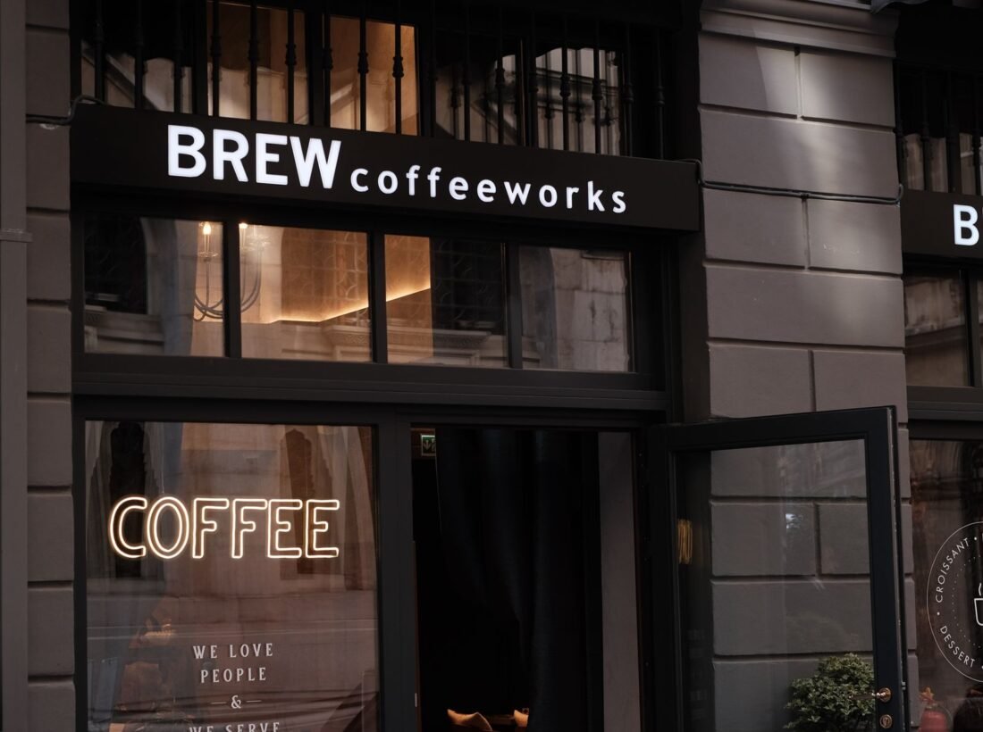
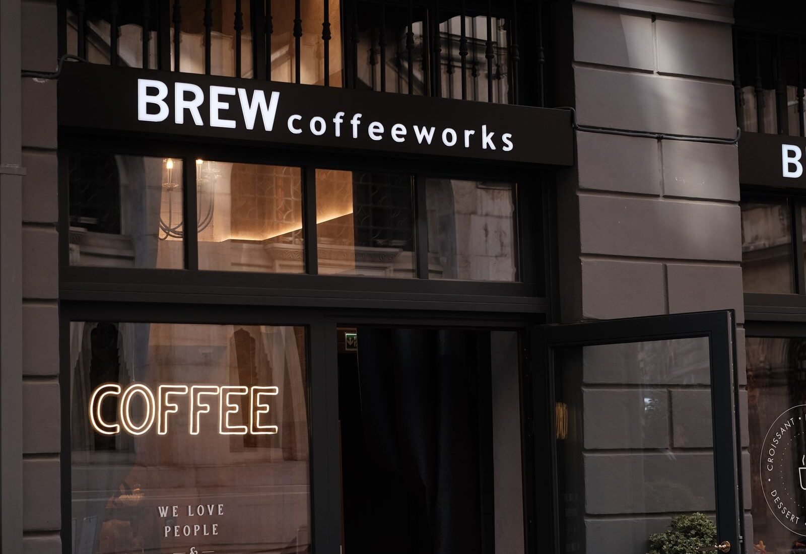
A logo with a one-colour version for stamps, a menu card and table tents, paper cups and sleeves, a shop-front sign and door vinyl, bookmarks given with every order, and an Instagram template set for daily specials and book picks.
The work