Dry Basket
A new dry fruit and snack brand needed a name people trust, a logo that works on a pouch and on a phone screen, and packs that stand out in a kirana store and an online listing.
The challenge
Soltrio Foods was launching Dry Basket, a range of healthy dry fruits and snacks, into a category full of near-identical brown and gold packs. Shoppers could not tell one brand from the next, and many were comparing options on a phone screen the size of a palm.
The brief was simple to say and hard to do: look trustworthy, look fresh, and be recognisable from a metre away.
Our approach
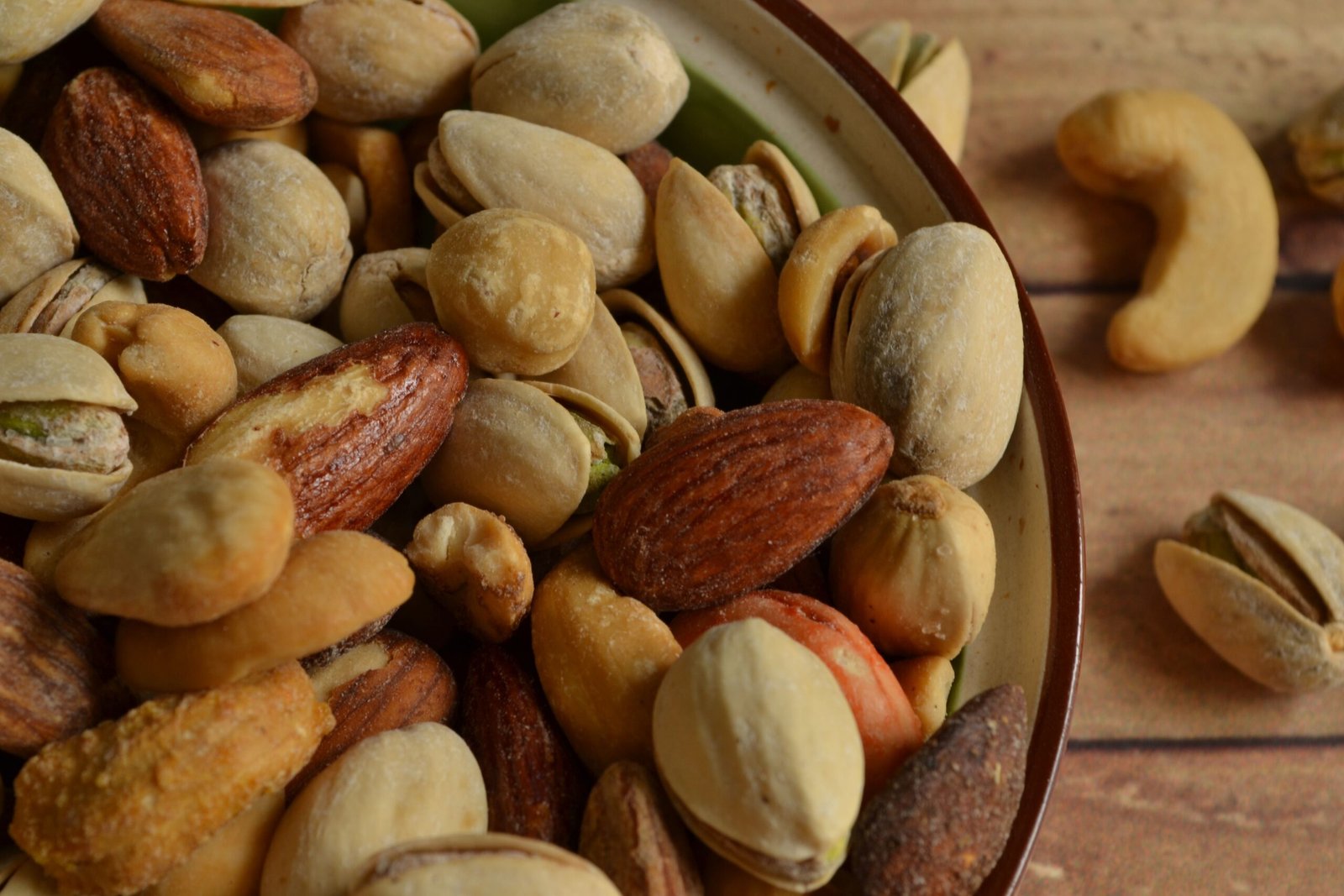
We started by laying competing packs side by side and noting what they all did the same. Almost all used the same earthy palette and the same stock photograph of nuts. Dry Basket would do the opposite: lighter colour, clear typography and a colour code for each product, so a shopper finds their favourite without reading.
We sketched the logo on paper, tested it at favicon size and on a 500 g pouch, and built the whole pack system around it.
The solution
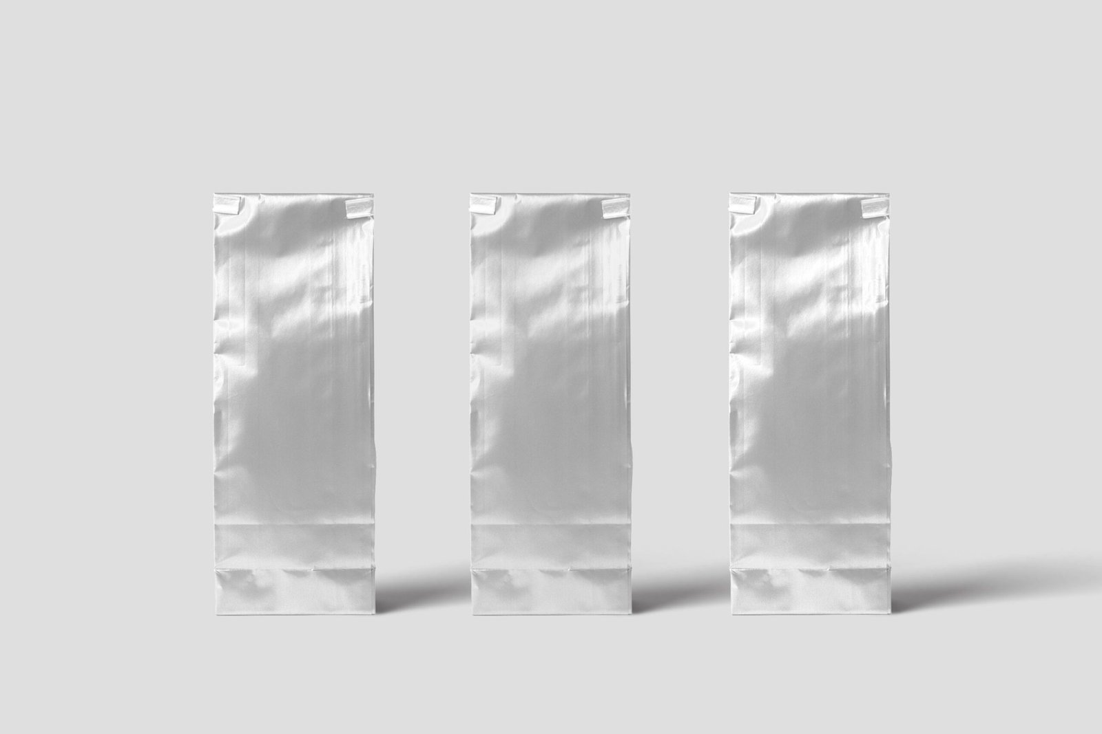
The final identity has a compact logo, a fresh palette and a layout where product name, weight and one benefit line are readable from far away. Each variant gets its own colour band, so the range looks like one family on a shelf and in a marketplace grid.
We delivered pouch artwork, dielines, a brand story page, social media templates and a short style guide for the team.
The work