Pharma packaging design: a layout and review checklist before artwork goes to print
A practical checklist for pharma cartons and labels: hierarchy, variant differentiation, regulatory text space, print zones and proof stages, so artwork is right the first time.
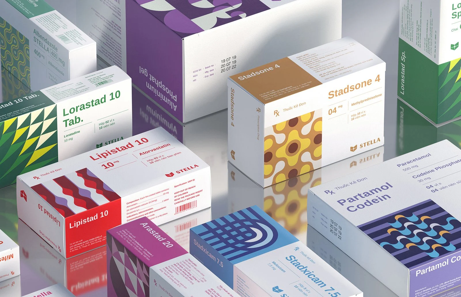
Good pharma packaging design makes the brand name and strength easy to read, keeps variants clearly different, reserves proper space for approved regulatory text and printing codes, and is checked through a structured proof process before print. The regulatory content comes from your regulatory team; the designer’s job is to lay it out so it is legible and printable.
Pharma packs carry more information than almost any other consumer product, and every line of it has to be readable by a pharmacist in a hurry. That makes layout the real challenge: the box has to look like a brand and behave like a safe, well-organised label. Most expensive reprints come from avoidable layout and proofing problems, not from the design idea itself.
Who is responsible for what?
Be clear about this before design starts, because confusion here causes the most delays.
| Task | Owner |
|---|---|
| Approved label text, claims, composition, warnings | Your regulatory affairs or quality team |
| Brand hierarchy, layout, colour system, typography | Design studio |
| Dieline, board, finishing and print feasibility | Printer, with the studio coordinating |
| Final sign-off before print | Your regulatory, quality and marketing heads |
India’s drug labelling particulars are set out in the Drugs and Cosmetics Rules. Requirements differ by product type, so always confirm the exact content and sizes with your regulatory team and the CDSCO before artwork is finalised.
1. Start with a clear information hierarchy
A pharmacist should find the brand name, the generic name and the strength within a second or two. Decide the reading order before choosing colours:
- Brand name
- Generic name and strength
- Dosage form and pack size
- Supporting claims or tagline, kept small
- Regulatory text panel
If everything is bold, nothing is. Reserve the strongest weight and size for the first two lines.
2. Differentiate variants and strengths
Look-alike cartons are a well-known risk in pharmacies. Where one brand has several strengths or related products, build a system that makes each variant instantly different: a strength band in its own colour, a consistent position for the strength number, and a distinct panel treatment for each product family. Review the whole range side by side on a shelf mockup, not one box at a time.
3. Protect legibility of regulatory text
Dense text needs room. Practical rules of thumb:
- Use a clean sans-serif or serif designed for small sizes and avoid condensed styles for body text.
- Keep strong contrast between text and background, and avoid text over gradients or images.
- Check the minimum type sizes required for your product type with your regulatory team, then design the panel to fit them without squeezing leading.
- Leave consistent margins so text never sits on a fold or glue flap.
4. Reserve space for codes and printed batch details
Batch number, manufacturing and expiry details are usually printed later by the manufacturer. Reserve a clear, flat, uncoated panel for this, away from varnish, foil and folds, or the print will smudge or fail. Do the same for barcodes or QR codes: keep clear space around them and avoid placing them on curved or heavily textured areas.
Print the carton at actual size on plain paper and read it at arm’s length, then again from a metre away. Problems with hierarchy and small text show up immediately and cost nothing to find.
5. Plan finishing for the real printing process
Spot UV, foil and embossing can lift a premium brand, but each one has constraints. Raised or foiled areas should not overlap fine text, and very small reversed-out text can fill in during printing. Talk to the printer early about board, coating and registration tolerances, and ask for their dieline instead of drawing a generic one.
We design cartons, labels, strips and visual aids for pharma companies from your approved text, with dielines and print-ready files coordinated with your printer.
6. Run a structured proofing process
Most errors are caught or missed at proof stage. A reliable sequence:
- Layout proof: design and hierarchy reviewed by marketing.
- Content proof: every line of text compared against the approved source document by regulatory or quality.
- Technical proof: dieline, bleed, barcode, colours and finishing checked with the printer.
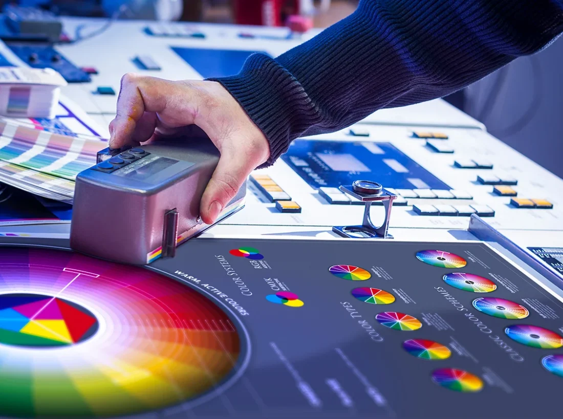
- Print proof or press check: colour and registration confirmed on the actual board where possible.
Give each version a number and keep a log of who approved which version. When several people send comments by WhatsApp, consolidate them into one list per round.
Pre-print checklist
- Brand name, generic name and strength readable at arm’s length
- Each variant clearly different from its neighbours on a shelf mockup
- All regulatory text matches the approved source word for word
- Text sizes confirmed against your regulatory requirements
- Clear, flat panel reserved for batch and expiry printing
- Barcode or QR code with clear space and tested scan
- Dieline supplied by the printer, with bleed and safe margins respected
- Version number and approvals recorded
- Central Drugs Standard Control Organisation (CDSCO): official source for drug regulation in India.
Questions and answers
Who writes the text on a pharma carton?
The approved text, claims and warnings come from your regulatory affairs or quality team. The design studio lays that text out clearly and prepares print-ready files.
How do you stop pharma packs from looking alike?
Build a system with a distinct colour band or panel treatment for each strength and product family, keep the strength in a consistent position, and review the full range together on a shelf mockup.
What should be left blank for batch and expiry printing?
Reserve a clear, flat, unvarnished panel away from folds, foil and embossing so later printing stays legible. Confirm the exact area with your printer and manufacturing team.

A design studio in Pune, Maharashtra making logos, brand identities, packaging, websites and campaigns for companies that sell real products and services.