How a logo design project works: stages, timelines and what you approve
From brief to final vector files: the stages of a professional logo project, what you are asked to approve at each one, and how to keep it on schedule.
A professional logo project moves through five stages: brief, research, concepts, refinement and final files. At our studio it normally takes two to three weeks, and most delays come from late feedback rather than from design time.
If you have never commissioned a logo, the process can feel like a black box: you send a brief, wait, and receive something. In practice a good project is a series of small decisions, each one narrowing the direction. Knowing what is expected from you at each stage is the easiest way to get a better logo and keep the timeline short.
Stage 1: The brief
Everything starts with a short conversation or form. A useful brief answers six questions:
- What does the business sell, and to whom?
- Who are the three competitors a buyer would compare you with?
- Where will the logo appear most: cartons, signboards, website, uniforms, social media?
- Does the name stay as it is, and is there a tagline?
- Which logos do you like, and which do you dislike, and why?
- Who gives the final approval?
The last question matters more than it looks. A logo approved by one decision maker moves quickly. A logo that has to satisfy five partners moves slowly, so agree who has the final word before concepts begin.
Stage 2: Research and direction
Before drawing anything final, the designer looks at your competitors, your industry’s visual habits and the surfaces your logo has to work on. A pharma brand, a food brand and an engineering company all have different conventions, and the useful question is where to follow them and where to deliberately stand apart.
You may see a short direction note or mood board at this point. This is your cheapest chance to correct course: changing direction on paper costs minutes, changing it after refinement costs days.
Stage 3: Concepts
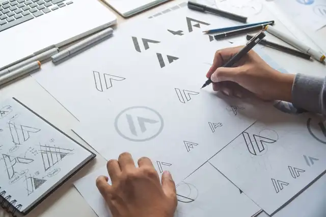
We sketch on paper first, because ideas come faster there, and then develop the strongest routes on screen. You usually see a small number of distinct concepts rather than dozens of variations. Each should be shown in black and white first, so you judge the idea and not the colour.
When you review, test each concept the way it will be used:
- Shrink it to the size of a favicon or a pen print.
- Place it on a mock signboard or carton.
- Look at it in one colour.
- Ask someone outside your team what it reminds them of.
Give feedback as problems, not solutions. “It feels too serious for a children’s range” is more useful than “make it pink”. The designer can then solve the real issue in a way you may not have thought of.
Stage 4: Refinement
Once one direction is chosen, the work becomes precise: spacing between letters, balance of shapes, weight of lines, and colour values for print and screen. This is where a good logo separates from an average one, because small adjustments decide whether the mark looks confident at every size.
Typical revision rounds happen here. Agree upfront how many are included, and collect all feedback from your team into one message per round. Scattered comments over several days are the most common reason a two-week project becomes six.
Stage 5: Final files and handover
A finished logo is more than one image. The handover should include:
| Item | Why you need it |
|---|---|
| Primary, stacked and icon versions | Different shapes fit signboards, social profiles and small labels |
| Full colour, black, white and reversed | Packaging, stamps and dark backgrounds |
| Vector files (AI, EPS, SVG, PDF) | Any printer or designer can resize without losing quality |
| PNG and web versions | Website, email and social media |
| Clear space and minimum size | Stops the mark being squeezed or shrunk too far |
Make sure the agreement states that you own the final artwork and source files once the project is paid for.
Our logo projects follow exactly these stages, with black-and-white concepts first and every version a printer or developer needs at handover.
How long does each stage take?
These are working estimates for a typical project at our studio, and they shift with feedback speed.
| Stage | Typical time | What slows it down |
|---|---|---|
| Brief and research | 2 to 4 days | Unclear approver, missing competitor list |
| Concepts | 4 to 6 days | Changing the brief after work starts |
| Refinement | 4 to 6 days | Feedback arriving in pieces |
| Final files | 1 to 2 days | Late approval of colours |
Together that fits the two to three weeks we quote for a logo. A larger identity with guidelines usually takes five to eight weeks.
Mistakes that cost time and quality
Starting without a decision maker
Nominate one person to consolidate feedback and approve. Opinions from everyone else are welcome, but they should reach the designer through one voice.
Judging a logo only in colour
Colour can hide weak shapes. If a mark does not work in black and white, it will struggle on stamps, fax-style prints and one-colour labels.
Forgetting the trademark check
Before you print thousands of cartons, check that the name and mark are not already registered by someone else in your class of goods.
- Intellectual Property India: the official portal for trademark search and registration in India.
Questions and answers
How long does a logo design project take?
At our studio a logo usually takes two to three weeks including revisions. The time depends mostly on how quickly feedback and approvals arrive.
How many logo concepts should I expect?
A small number of clearly different concepts is more useful than many variations. After you choose one direction, the designer refines it through revision rounds.
Which files should I receive at the end of a logo project?
Vector files such as AI, EPS, SVG and PDF, plus PNG versions, in full colour, black, white and reversed, with the primary, stacked and icon versions and basic clear space and minimum size rules.
A design studio in Pune, Maharashtra making logos, brand identities, packaging, websites and campaigns for companies that sell real products and services.