How to design a food or FMCG pack that stands out on a crowded shelf
Shelf impact is decided in about three seconds. Here is how to plan hierarchy, colour, flavour variants and mandatory information so a food or FMCG pack gets picked up.
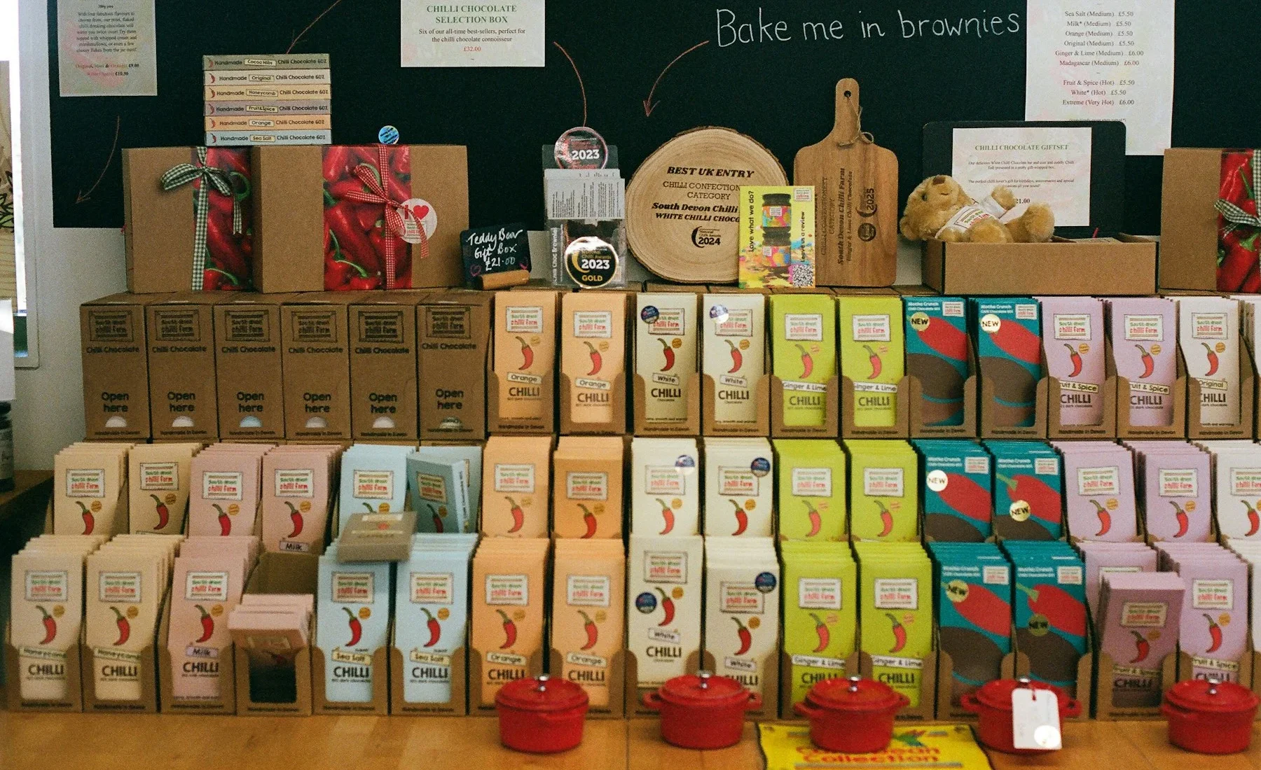
A food or FMCG pack stands out when it communicates one clear idea at a glance, uses colour and shape differently from its neighbours, separates variants with a simple system, and still leaves proper room for the mandatory information. Test it on a real shelf or a shelf mockup, not on a screen alone.
On a supermarket or kirana shelf, your pack competes with dozens of others, and the shopper is usually moving. The pack has a very short time to say what it is, who it is for and why it is different. Good packaging design is less about decoration and more about deciding what to say first.
Start with the shelf, not the pack
Before any design work, photograph the category where your product will sit: the supermarket aisle, the kirana counter, the online listing thumbnail. Note the dominant colours, the common shapes and the claims everyone repeats. Your pack should be easy to find among them, which means deliberately choosing where to differ.
For online sales, remember the pack will often be seen as a thumbnail. The brand name and product type must stay readable when the image is the size of a thumbnail.
The three-second hierarchy
Decide what the shopper must understand, in this order:
- What it is: the product type, such as mango pickle or roasted makhana.
- Who it is from: the brand mark.
- Why choose it: one short differentiator, such as a flavour, an origin or a pack format.
Everything else, including secondary claims, certifications and instructions, belongs lower in the hierarchy or on the back. A pack that shouts five messages communicates none.
Use colour, shape and imagery with purpose
Colour
Category conventions exist for a reason: shoppers read green as natural, red as spicy or bold, blue as clean or fresh. You can follow a convention to be understood, or break it to be noticed, but do it knowingly. Check that your palette still reads in poor shop lighting.
Shape and format
A pouch with a window, a jar with a distinct lid or a carton with an unusual panel layout can differentiate as much as graphics do. Talk to your packaging supplier about what is feasible at your volumes before you fall in love with a structure.
Imagery and appetite appeal
Use real, well-lit food photography or confident illustration. Avoid stock images that look generic or show a product that does not match what is inside, since that damages trust at the first repeat purchase.
Squint at the pack from two metres away. The brand name, the product type and one dominant colour block should still be visible. If they are not, the hierarchy needs work.
Design a variant system, not separate packs
If you sell several flavours or sizes, design one family. Keep the brand mark, layout and key elements in the same position, and let one element change per variant, usually colour or a flavour illustration. This gives you a stronger shelf block and makes new variants quick to add later.
| Keep constant | Change per variant |
|---|---|
| Brand mark and position | Dominant colour or accent |
| Layout grid and type styles | Flavour name and illustration |
| Claim positions | Variant-specific claim |
We design food and FMCG packs as complete systems, with the front hierarchy, variants, back panel and print-ready dielines planned together.
Leave room for mandatory information
Food packs in India typically carry a set of required declarations, which can include ingredients, nutrition information, a vegetarian or non-vegetarian mark, net quantity, manufacturer details and licence numbers. Packaged commodities also fall under Legal Metrology requirements. The exact content, placement and minimum sizes depend on your product, so verify them with the official sources and your compliance advisor before artwork is finalised, and plan the panel space at the start rather than squeezing it in at the end.
Check it before you print
- Print a full-size mockup and place it among competitor packs.
- Test colour on the actual material, since pouches, cartons and labels each shift colour differently.
- Confirm barcode scanning, text sizes and legibility of declarations.
- Get printer proofs for any foil, matte or gloss effects.
- Food Safety and Standards Authority of India (FSSAI): official source for food labelling and licensing requirements.
- Department of Consumer Affairs: includes Legal Metrology information for packaged commodities.
Questions and answers
How do I make my food packaging stand out?
Photograph the category shelf first, then choose where to differ in colour, shape or format. Keep one clear message at the top of the hierarchy and test a full-size mockup among competitor packs.
How should I design packaging for multiple flavours?
Build one pack family with a constant brand mark and layout, and change a single element such as colour or illustration per flavour. This creates a stronger shelf block.
Do I need to plan space for mandatory information?
Yes. Food packs typically carry required declarations, so plan the panel space at the start and verify exact content and sizes with official sources and your compliance advisor.

A design studio in Pune, Maharashtra making logos, brand identities, packaging, websites and campaigns for companies that sell real products and services.