How to choose brand colours and fonts for your business
A simple method to choose brand colours and fonts: build a small palette, pair two fonts, test on real material and record the rules.

Choose one main colour, one accent and a few neutrals, then pair two fonts: one for headings and one for body text. Pick them for your audience and industry, check that text is readable on every background, test them on real packaging and web pages, and write the values down in your brand guidelines.
Colours and fonts are the most visible part of a brand. When they are chosen well and used the same way everywhere, customers recognise you faster and trust you more. When they drift between your signboard, packaging and website, the brand looks unplanned. This guide gives a simple method you can follow.
1. Start from your audience and market
Ask who buys from you, what they should feel, and what your competitors already use. Colours carry associations, but meanings differ across cultures and industries, so treat them as a starting point, not a rule. A palette that looks like every competitor will not help people remember you.
2. Build a small palette
| Role | Use |
|---|---|
| Main colour | Logo, headings, key surfaces |
| Accent colour | Buttons, highlights, calls to action |
| Neutrals | Text, backgrounds, borders |
| Support colours (optional) | Charts, product ranges, status messages |
Check text contrast before you finalise. Light text on a light background, or coloured text on a coloured block, is hard to read on phones and in print.
3. Pair two fonts
- Choose one font for headings with some personality, and one plain, readable font for body text.
- Check the fonts have the weights you need and support the languages you use, such as English and Hindi or Marathi if needed.
- Confirm the licence allows use on your website and in print.
- Set a fixed size scale so headings and text look the same on every page.
4. Test on real material
View the palette and fonts on a pack, a visiting card, a signboard mock-up and your website. Colours change between screen and print, so check a printed sample. Our print-ready artwork checklist explains colour modes and proofs.
We create brand identities for Pune businesses, from logo, colours and fonts to packaging, print and website. Share your business on WhatsApp and we will suggest a palette and brand rules.
5. Write the rules down
Record colour values for screen and print, font names, sizes, and examples of correct and incorrect use. Our article on what to include in brand guidelines lists the essentials. To apply them online, see how to make a website that looks like your brand.
Common mistakes
Too many colours
A long palette looks unplanned and is hard to keep consistent.
Choosing only by personal taste
Your favourite colour may not suit your customers or your market. Test with real material.
Ignoring print
A bright screen colour can print dull. Check CMYK and a printed sample.
No recorded values
Without colour codes and font names, every designer will guess and the brand will drift.
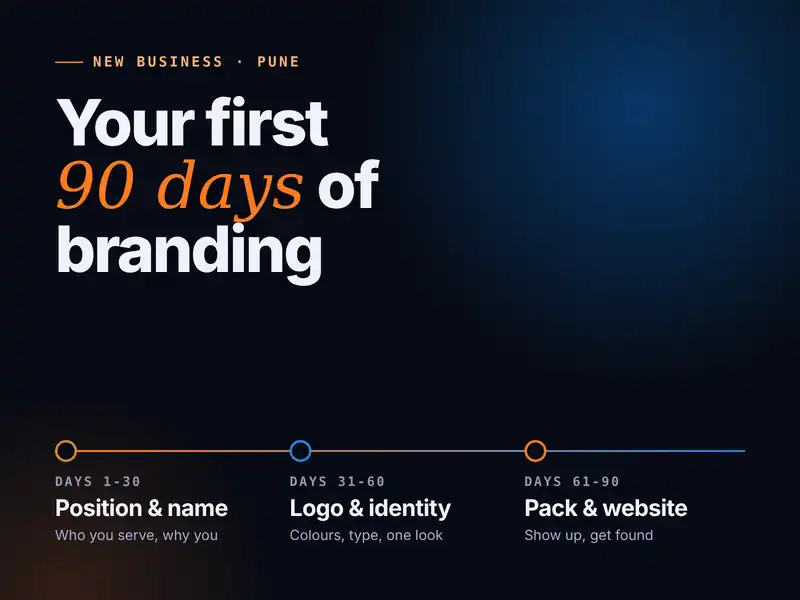
If you are starting a new business, also read branding a new business in Pune: the first 90 days.
Logo design in Pune · Branding and brand identity · Contact us for a quote
Questions and answers
How many colours should a brand use?
Usually one main colour, one accent and a few neutrals. A small palette used consistently looks more professional than many colours.
How many fonts should a brand use?
Two is enough for most businesses: one for headings and one for body text, used in a fixed size scale.
How do I choose a brand colour?
Start from your audience, your industry and what you want people to feel, then look at competitors so you can stand out. Test the colour on packaging, website and print before you decide.
Do I need colour codes for my brand?
Yes. Record the colour values for screen and for print, such as HEX or RGB and CMYK, so every designer and printer matches them.

A design studio in Pune, Maharashtra making logos, brand identities, packaging, websites and campaigns for companies that sell real products and services.